

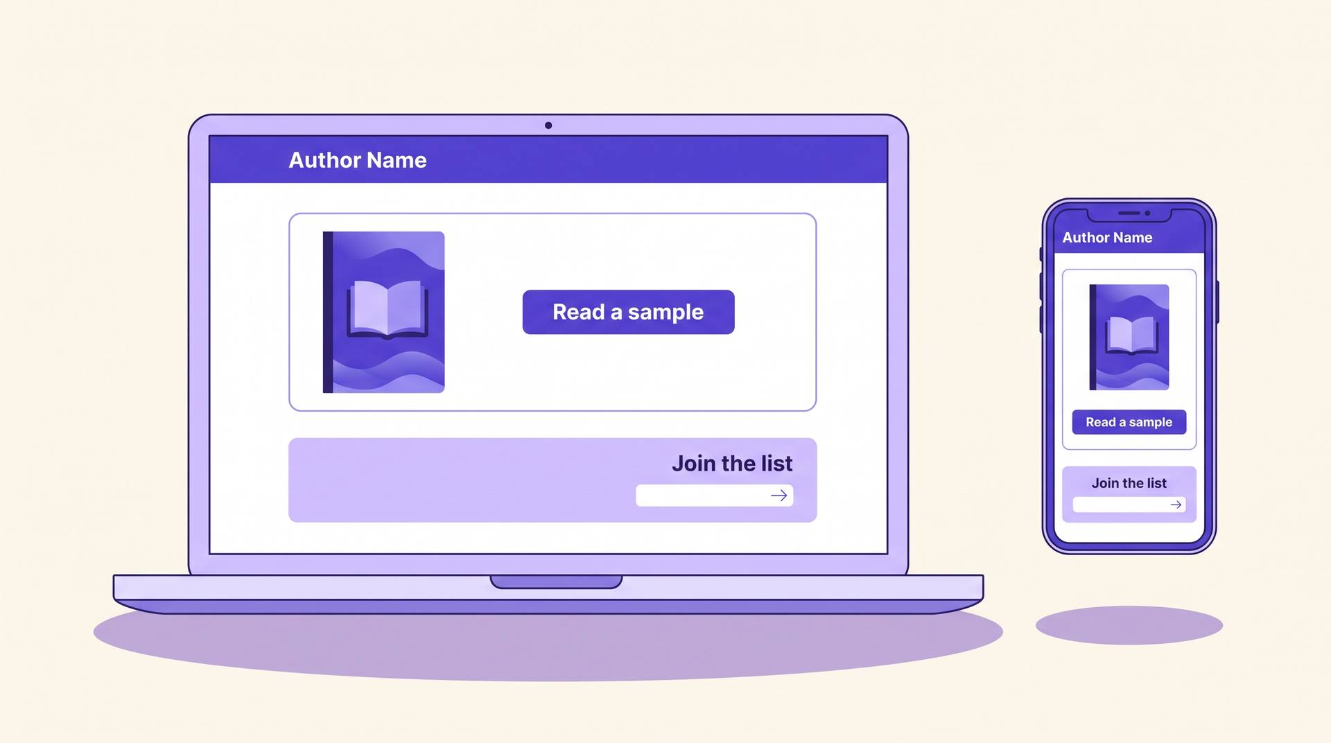
The two-job rule
Ask ten authors what their website is for and you get ten answers: credibility, discovery, a home base, somewhere to send people. All of those are real, none of them tell you what to build. So use a harder rule: your site has exactly two jobs, and every element either serves one of them or comes off the page.
Job one is to convert a curious visitor into a buyer — someone who arrived from a podcast mention, a book's back matter, or a Google search for your name, and who leaves holding a purchase link. Job two is to convert the visitors who aren't ready to buy into email subscribers, because an email address is the only channel you own. Social platforms rent you your audience and change the rent whenever they like.
That second job is why a site earns its keep even for authors with one book. Amazon tells you nothing about who bought it. A list of 400 readers who liked book one is the single most valuable asset a self-published author can build, and the site is where it gets built.
The five-minute visitor test
Before redesigning anything, audit what you have. Open your site on a phone, and check each of these. Tick the ones that are true right now — the score at the bottom tells you whether the problem is your design or your priorities.
0 of 8 in place
It's a business card, not a machine
Most of the traffic you send here is leaking straight back out. The good news is that the fixes are content, not code — a buy link, a cover, and a reason to subscribe will move this further than any redesign.
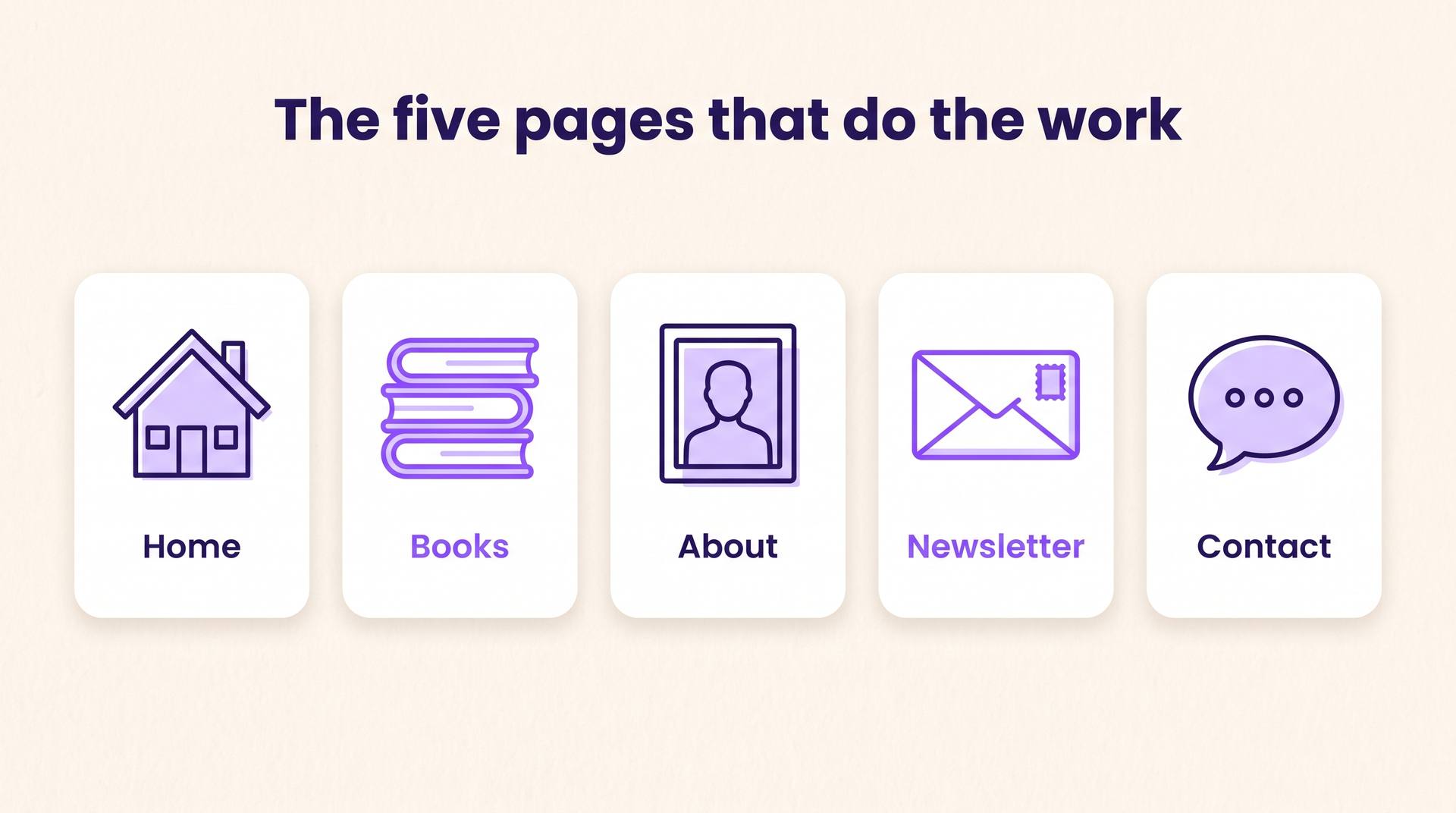
The five pages that do the work
Author sites fail in both directions: some are a single scrolling page with no depth, others have fourteen tabs including a photo gallery. Five pages covers everything a reader needs and nothing they don't.
Home
One job: orient and route. Name, genre, the most recent book's cover, one line about what you write, a buy button, and a signup. Resist the urge to make it a mood board. A reader who lands here should be one click from whatever they came for.
Books
An index of everything you've published, newest first, each cover linking to its own page. If you write in series, group by series and number them visibly — readers abandon authors whose reading order they can't figure out in ten seconds.
About
The second-most-visited page on almost every author site, and usually the worst written. Readers come here to decide whether they trust your taste, not to read a CV. Two short paragraphs, one photo, and something specific and human.
Newsletter
A dedicated page you can link from your books' back matter, your social bios, and your podcast appearances. It should state the offer plainly: what subscribers get, how often, and what happens the moment they sign up.
Contact
A form or an address, plus one line about what you do and don't answer. Bloggers, podcasters, event organisers and rights enquiries all need this, and they will not hunt for it.
A blog is optional and, for most fiction authors, a trap — an abandoned blog whose last post is from three years ago actively damages credibility. If you want the search traffic, write a handful of genuinely useful evergreen pages instead of a feed. Our guide to book marketing for self-published authors covers where that traffic actually comes from.
Anatomy of a book page
This is the page that makes money, and it is the one most authors treat as an afterthought — a cover, a paragraph of blurb, and a link. Four elements, in this order, do the heavy lifting.
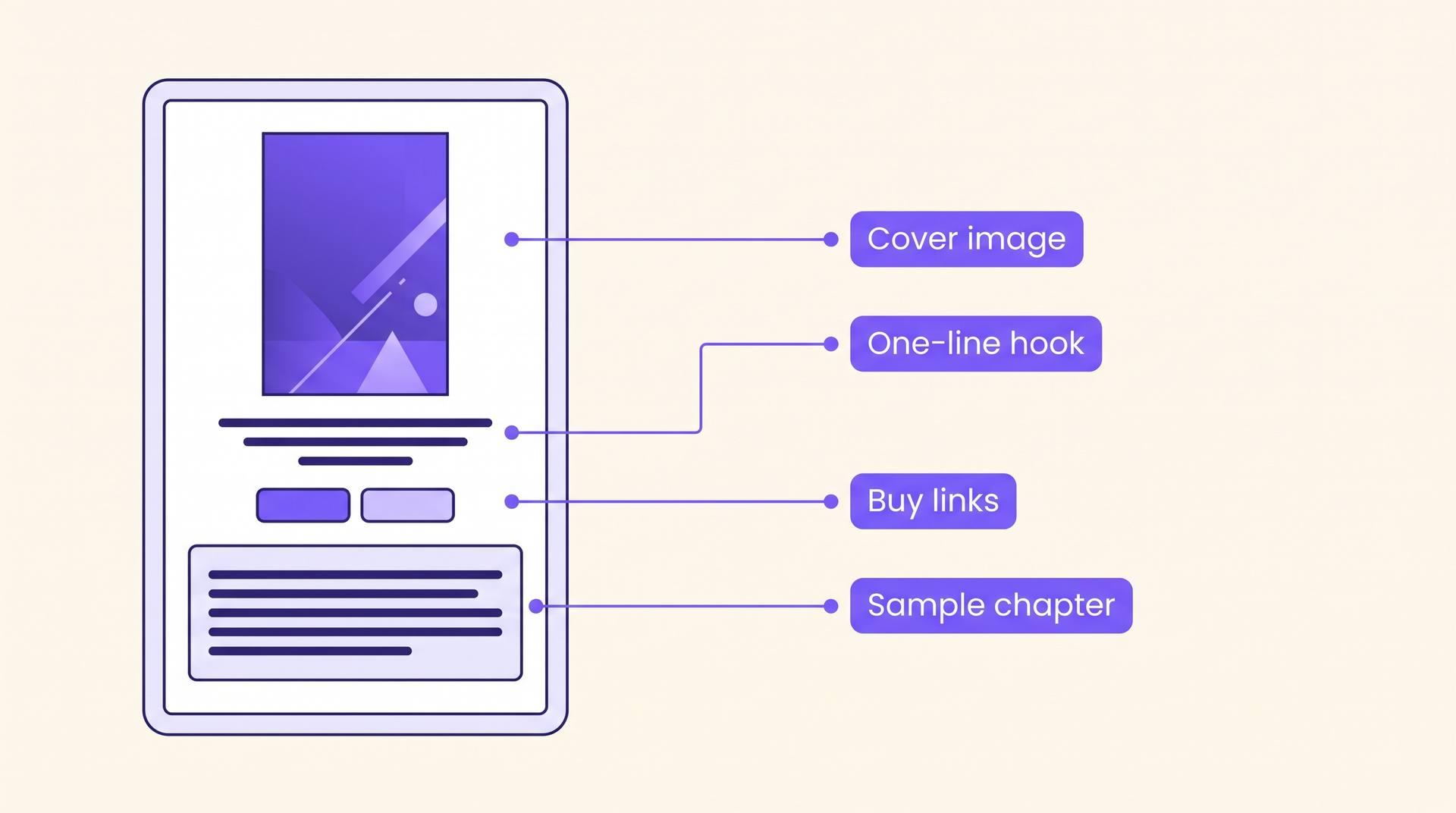
The cover, large
At the top, at a size where the title is readable on a phone. The cover is the only piece of your marketing that readers have already been trained to evaluate. If it looks self-published, nothing below it will rescue the page.
A one-line hook above the blurb
Not the blurb — one sentence that makes the premise concrete. Most visitors decide during this line whether to read the next paragraph. If writing it is painful, our blurb generator will draft several angles from your plot in a couple of minutes, and inside AIWriteBook the same metadata step produces the blurb, keywords and categories you'll need for your listing anyway.
Buy links, plural, near the top
Amazon first if that's where you sell, then anywhere else it's available, then a note if it's exclusive. Never bury purchase links at the bottom of a long page: readers scroll to find them, don't find them, and leave.
A real sample
The first chapter, readable on the page — not a download, not a PDF. Readers who finish a sample chapter are dramatically more likely to buy than readers who only read the blurb, because at that point they've already invested ten minutes. On an AIWriteBook author page the chapter preview and the buy links sit on the same page by default, which is exactly the layout you want.
Build it in a weekend
The reason most author sites don't exist is that the project is imagined as a redesign rather than a checklist. Here is the checklist. It is genuinely a weekend of work, and it is the correct order — copy before design, because designing around placeholder text is how projects stall.
- 1
Buy the domain first
Your name dot com if you can get it, otherwise your name plus 'writes', 'author' or 'books'. Buy it even if you build the site later — domains matching a pen name get taken, and changing yours after your books are in print means every printed back-matter link is dead.
- 2
Write the four pieces of copy
A one-line description of what you write, a two-paragraph bio, a newsletter offer, and a hook line per book. That is under 500 words total and it is 80% of the site. Our author bio generator is a fast way past the bio, which is the piece most writers stall on for weeks.
- 3
Set up the email list before the site
Pick any provider with a free tier, create the list, and write the welcome email. Doing this second means launching a site with a signup form that goes nowhere, and every subscriber collected in that window is lost.
- 4
Assemble the pages
Five pages, the copy you already wrote, your covers at full resolution. Whatever platform you chose, use its plainest template. Custom design is the last 5% of the value and the first 80% of the time.
- 5
Add the reader magnet
A signup incentive beats a bare form by a wide margin. A deleted scene, a prequel short, a character's backstory, or a genuinely useful checklist for non-fiction. It does not need to be long — it needs to be specific to the book they just read.
- 6
Link it from everywhere that already exists
Back matter of every book, your Amazon Author Central page, social bios, email signature. A site with no inbound links is a filing cabinet. If you haven't claimed it yet, our walkthrough of Amazon Author Central covers the one profile every KDP author should be pointing at their site.
Choosing where to host it
This decision absorbs far more author energy than it deserves. All of these work. Pick on the axis that actually matters to you and move on.
| Option | Best when | The catch |
|---|---|---|
| Site builder (Wix, Squarespace, Carrd) | You want it live this weekend and never want to touch code. | Monthly fee forever, and you're renting the platform. Fine for a five-page site. |
| WordPress | You plan to publish a lot of written content and want to own the whole stack. | Updates, plugins, security, and the very real risk the project becomes a hobby. |
| Author-specific hosting | You want book pages, buy links and a mailing list wired together without assembling them. | Less freedom over layout; you get the structure the tool believes in. |
| A page inside your writing tool | You publish through one platform anyway and want zero maintenance. | You don't control the domain in the same way, so keep your own domain pointing at it. |
AIWriteBook sits in that last row: the author page publishes your books with covers, blurbs, buy links, a chapter preview and an email capture form, and you can broadcast to the list you collect without a separate provider. If your site's entire job is the two jobs at the top of this article, that is the whole build.
Seven mistakes that cost you readers
A homepage that doesn't say what you write
A moody header image and your name in a serif font tells a visitor nothing. Genre, in words, in the first screen. Readers are sorting, not browsing.
'Sign up for my newsletter'
This asks for something and offers nothing. Say what arrives and how often: 'A short email when I publish, plus the deleted chapter from Book One.' Specific offers convert several times better than generic ones.
Buy links that go to the wrong storefront
A raw amazon.com link sends UK and Australian readers to a store they can't buy from. Use a geo-aware link, or list the regional stores explicitly.
Covers uploaded at thumbnail size
Blurry covers read as an amateur operation faster than anything else on a page. Upload the full-resolution file and let the site scale it down.
An About page written in the third person
It reads as a press release written by someone who doesn't have a press office. Write it as yourself, unless you're pasting it into a publication that requires third person.
No series reading order
If a reader has to open three book pages to work out what comes after Book Two, some of them simply stop. Number them on the covers and on the index page.
A site that's slow on mobile
Most of your visitors are on a phone, often on mobile data, often arriving from a link in a book they're reading on that phone. A hero video and six web fonts will lose more readers than a plain page ever did.
The AI-assisted shortcut
The reason author sites sit unbuilt is almost never the website. It is the 500 words of copy nobody wants to write. That part is genuinely faster with help, as long as you edit the result into your own voice rather than shipping the first draft.
Draft the copy blocks in one sitting
Bio, hook lines, newsletter offer, and a short description per book. Generate three versions of each and keep the phrasing that sounds like you, not the most polished one. Polished-neutral is what makes author sites interchangeable.
Turn back matter into signups
The last page of your book is your highest-converting piece of marketing, and most self-published books waste it. Our back matter generator builds the closing pages — the ask, the link, the next-book teaser — that send readers to the site in the first place.
Make the reader magnet from material you already have
A deleted scene or a character backstory does not require a new project. If the book was written in AIWriteBook, you already have the characters and the world, so a 1,500-word bonus scene in the same voice is one chapter's worth of work.
Do the visuals at the same time
You'll want a 3D cover image for the home page and a few social graphics for launch. The mockup generator and social graphics tool handle both, so the site and the launch assets come out of the same hour of work.
FAQ
You need the domain before, and the site by launch. Pre-publication the site has one job — collect emails from anyone who hears about the book early — so a single page with a description, a cover reveal and a signup form is enough. Build the full five pages in the month before release, when you have a cover, a blurb and a buy link to put on them.
Start with the two jobs
If you build nothing else this month, build a page with a readable cover, a working buy link, and a signup form that promises something specific. That page outperforms the elaborate site you keep meaning to commission, and it takes an afternoon.
Then leave it alone. The site is infrastructure, not a project — it should be finished, quietly working, and updated only when you publish something new. The returns are in the list it builds and the books you write while not redesigning it.
For everything that happens after the site is live — launch sequencing, reviews, ads, and where readers actually come from — the rest of our book marketing guide picks up from here.