

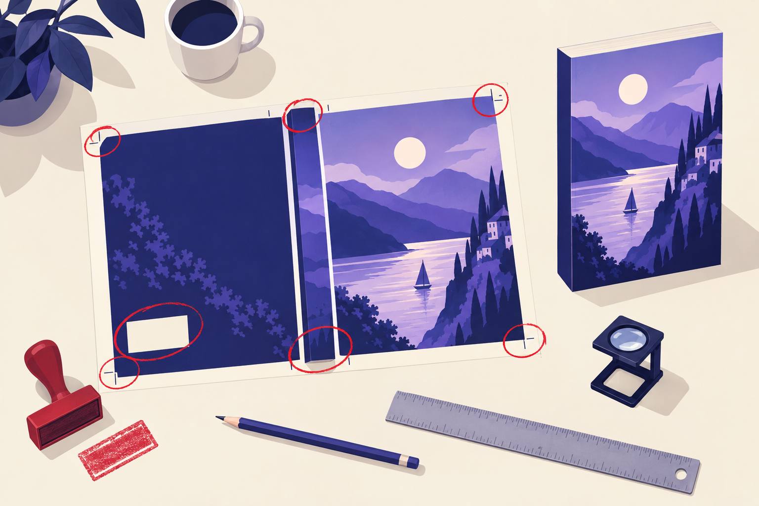
The five numbers behind most rejections
- 0.125 in
- Bleed on the top, bottom, and outside edges
- 300 DPI
- Minimum image resolution for print
- 80+ pages
- Safe page count for spine text
- 2 × 1.2 in
- Barcode box, lower right of the back cover
- 2560 × 1600
- Ideal eBook cover in pixels, height by width
The two gates every cover has to pass
Most advice about bad book covers mixes two very different problems. One is mechanical: KDP's print review checks your PDF against a spec and rejects it, sometimes days after you pressed Publish. The other is commercial: the file is fine, the book goes live, and nobody clicks. Treat them separately, because the fixes live in different places.
Gate 1: the file review
Pass or fail. Measured in inches, DPI, and page counts. Every rule is published, so every failure here is avoidable.
Gate 2: the search results page
No error message. You only see it as low click-through on ads and a flat sales rank. Measured in seconds of attention at about the size of a postage stamp.
If you want the principles of good design (genre conventions, color, type pairing), our book cover design tips cover that ground. For the spine and template math itself, the KDP cover calculator guide has a live calculator. This page is the failure list: what actually goes wrong, how to spot it, and how to fix it.
Decode your rejection
KDP's rejection emails name a symptom, not always the cause. Pick the one you got to see what usually triggers it.
Usual cause
The wrap was built for a different page count, paper, or trim than the interior you uploaded. Adding a dedication page or switching white to cream is enough.
Fix
Lock the interior first, then rebuild the wrap from the final page count and paper. Spine width is page count times paper thickness, so it moves with every page.
Eight technical mistakes KDP rejects
These are the paperback cover mistakes that stop a book at review. All eight come from KDP's own paperback cover and barcode specs.
- 01
No bleed, or bleed on the wrong edges
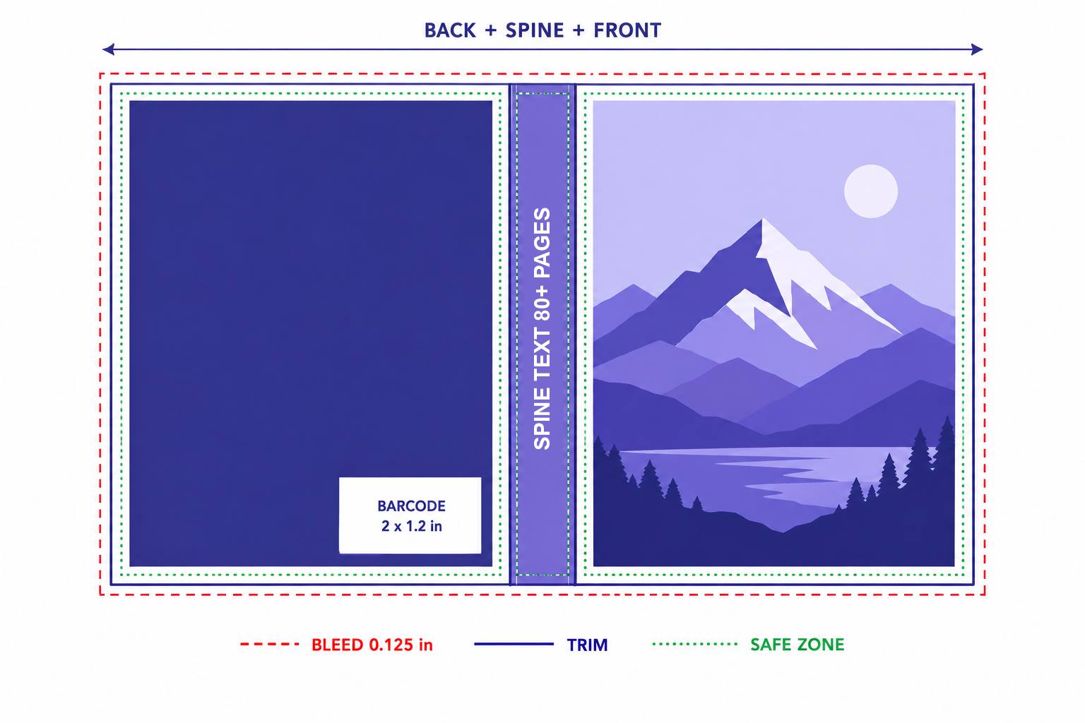
KDP wants 0.125 in of extra art on the top, bottom, and both outside edges. Not around the spine, which sits in the middle of one continuous sheet. Design to the exact trim and the blade leaves white slivers; KDP flags it before that happens.
- 02
Text in the trim danger zone
Anything within 0.125 in of the trim line can be cut. The classic case is an author name set flush to the bottom edge on the front, which looks fine on screen and loses its descenders in print.
- 03
Spine text on a book too thin to hold it
KDP's help page says it prints spine text only on books with more than 79 pages, and in another paragraph that you need at least 79. Build for 80 and you are safe either way. Below that, a plain color spine looks deliberate; a squeezed title looks like a mistake.
- 04
Spine text that hugs the folds
Binding drifts by up to 0.0625 in in either direction. A spine title that fills the full width will creep onto the front or back cover on some copies. Leave that clearance on both sides and center the type.
- 05
Art under the barcode box
If you don't supply a barcode, KDP prints one in a white 2 × 1.2 in box in the lower right of the back cover. It goes on top of whatever you put there: the last line of your blurb, a character's face, your publisher logo. Keep that corner quiet.
- 06
A homemade barcode that fails the spec
A barcode you add yourself must be 100% black on solid white, sharp, and at least 0.25 in from the spine and trim. A dark blue barcode on a cream panel is a common failure. Removing it and letting KDP add its own costs nothing.
- 07
Low-resolution or stretched art
Print needs 300 DPI at the printed size. A 1600-pixel-wide image stretched across a 13-inch wrap is roughly 120 DPI, which prints soft. Resize the canvas first, then place the art.
- 08
A messy PDF
KDP wants one PDF with back, spine, and front as a single image, fonts embedded, transparencies flattened, and CMYK color. Leftover template guides, crop marks, and color bars all have to go. Keep files around 40 MB; KDP won't convert anything over 650 MB.
Four eBook cover mistakes
The Kindle eBook cover is a different file with different rules, and most errors come from reusing the print file.
Uploading the full wrap
KDP's cover guidelines say the eBook cover should not include a spine, barcode, back cover, or inside flap. Export the front panel only.
Wrong size or shape
The ideal is 2560 pixels tall by 1600 wide, a 1.6:1 ratio. The minimum is 1000 by 625, and small images stretched to fit look blurry on high-resolution screens.
CMYK instead of RGB
Print wants CMYK; the eBook wants RGB. Upload a CMYK JPEG and colors can shift or the file can fail. Keep two exports.
A white cover with no edge
White and pale covers vanish against Amazon's white page. KDP itself suggests a 3 to 4 pixel border in medium gray to give the cover an edge.
Seven design mistakes that cost clicks
A cover that passes review can still be a bad book cover. These mistakes don't produce an error. They produce silence.
| Mistake | What the shopper sees | Fix |
|---|---|---|
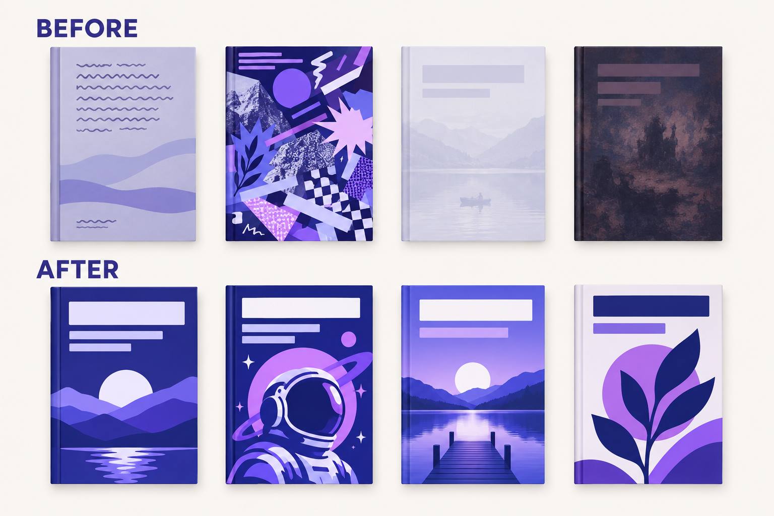
| Title too small | A gray smear where the title should be | Title takes a third of the height or more; check at 150 pixels wide |
| Five ideas on one cover | Visual noise, no genre signal | One focal image, one title treatment, one palette |
| Low contrast | Pale text dissolving into a pale photo | Put a dark band or gradient behind the type, or flip to light-on-dark |
| Muddy, dark art | A brown rectangle | Lift midtones and add one bright accent color |
| Off-genre signals | A thriller that looks like a cookbook | Match the top 20 in your category first, then add one distinct element |
| Copying a bestseller too closely | A knock-off, and a policy risk | KDP bans covers that closely resemble another book's layout, colors, fonts, or images |
| Promo text on the cover | A cover that dates itself | KDP bans prices and temporary promotional offers on covers; put deals in ads instead |
One more for 2026: obvious AI art. Garbled lettering, six-fingered hands, and that glossy over-rendered look tell readers the inside may be rushed too. Zoom to 100% and check every letter and every hand before you upload. If you use AI-generated imagery, KDP also asks you to disclose it; our KDP AI disclosure guide explains what counts.
Two worked examples
Here is the same checklist applied to two real-world shapes of book. The spine numbers use KDP's paper multipliers: 0.0025 in per page for cream, 0.002252 in for white.
A 312-page thriller, 6 × 9 in, cream paper
Spine: 312 × 0.0025 = 0.78 in
Full wrap: 6 + 0.78 + 6 + 0.25 bleed = 13.03 in wide, 9.25 in tall
Room for spine text. After 0.0625 in of clearance on each side, the usable band is about 0.65 in, enough for title and author in one line. The risk here is the back cover: a long blurb tends to run into the barcode corner, so end it higher.
A 72-page activity book, 8.5 × 11 in, white paper
Spine: 72 × 0.002252 = about 0.16 in
Full wrap: 8.5 + 0.16 + 8.5 + 0.25 bleed = about 17.41 in wide, 11.25 in tall
No spine text: 72 pages is under the threshold. Run the front art across the spine as plain color. The usual mistake is a bold title on the spine that the review rejects, followed by a scramble to redesign.
A designer brief that prevents all of this
Whether you hire a designer, use a template, or generate the art yourself, hand over the numbers in writing. Fill in the brackets, copy it, and most of the mistakes above can't happen.
Book: [title] by [author name exactly as on KDP]
Format: paperback, [trim] in, [page count] pages, [white/cream] paper
Spine width: [page count × paper multiplier] in
Full wrap: [trim width × 2 + spine + 0.25] × [trim height + 0.25] in
Bleed: 0.125 in on top, bottom, and outside edges
Safe zone: all text 0.125 in inside trim; spine text 0.0625 in clear of each fold
Barcode: leave the lower right of the back cover clear, 2 × 1.2 in
Files: one flattened PDF, 300 DPI, CMYK, fonts embedded
eBook: front only, 2560 × 1600 px, RGB JPEG
Genre: [category], look at [three current top-20 covers]
No prices, promos, or text I haven't approved
The faster route
Most of these mistakes are arithmetic done by hand. AIWriteBook does the arithmetic for you. The book formatter builds the print cover wrap from your book's actual page count and paper, sizes the spine, reserves the 2 × 1.2 in barcode zone, and only allows spine text when it fits. It also flags a cover that's under 300 DPI or out of step with the final page count before you export.
For the art itself, the cover step works in two passes: first a background with no lettering, then a separate pass that adds your title, author, and subtitle at the size and placement you pick. You type exactly what should appear, and if a letter comes out wrong you can edit or regenerate before you accept the cover. It can also place up to three characters from your story bible. If you'd rather start outside the app, try the free AI cover generator or cover prompt writer, then preview the result as a 3D paperback in the mockup generator before you order a proof.
Book cover mistakes: FAQ
A size mismatch. The wrap was built for a different page count, paper, or trim than the interior that was uploaded, so the spine is the wrong width. Rebuild the cover from the final interior.
No. KDP only prints spine text on books with more than 79 pages. Leave the spine a plain color until the book is thicker.
No. If you leave it off, KDP adds a correctly formatted barcode to the lower right of the back cover for free. Just keep that 2 × 1.2 in area clear of text and important art.
KDP's cover guidelines ban prices and temporary promotional offers on covers. Keep claims off the cover and put promotions in your ads and description.
No. The paperback needs a full wrap PDF in CMYK with bleed; the eBook needs the front cover only as an RGB JPEG or TIFF, ideally 2560 × 1600 pixels.
Usually a title too small to read at thumbnail size, too many competing elements, weak contrast, and signals from the wrong genre. Test it at 150 pixels wide next to the top sellers in your category.
Fix the file, then fix the thumbnail
The technical book cover mistakes are the easy half: every one of them has a published number, and a single checklist catches them all. The design half takes judgment, but it gets much easier once you judge the cover at the size a shopper actually sees it.
Once your cover passes both gates, move on to the rest of the listing. The complete Amazon KDP guide walks through metadata, categories, and launch.